Monday, March 23, 2009

PirateBay and a trial

the prosecution plead for banning the essence of the internets, the links.

To ban the links? What does prosecutions smoke? Must be a really good sh!t...

Thursday, March 19, 2009

Moon: Get a Facts!

Here how it was actually:

Monday, March 16, 2009

Mercurial and Terminal.app on Mac OS X

Get a latest Mercurial from here and... bang!


Traceback (most recent call last):
File "/usr/local/bin/hg", line 25, in
mercurial.util.set_binary(fp)
File "/Library/Python/2.5/site-packages/mercurial/demandimport.py", line 75, in __getattribute__
self._load()
File "/Library/Python/2.5/site-packages/mercurial/demandimport.py", line 47, in _load
mod = _origimport(head, globals, locals)
File "/Library/Python/2.5/site-packages/mercurial/util.py", line 93, in
_encoding = locale.getlocale()[1]
File "/System/Library/Frameworks/Python.framework/Versions/2.5/lib/python2.5/locale.py", line 460, in getlocale
return _parse_localename(localename)
File "/System/Library/Frameworks/Python.framework/Versions/2.5/lib/python2.5/locale.py", line 373, in _parse_localename
raise ValueError, 'unknown locale: %s' % localename
ValueError: unknown locale: UTF-8

Yes, because it is Terminal.app, it is not XTerm. Apple had a years to add Spotlight, but had zero time to fix a bug, that is for years around: bad locale handling. To fix the bones, add into .profile this explicitly:


export LC_ALL=en_US.UTF-8
export LANG=en_US.UTF-8

...or foo_BAR about your other locale.

Ad on my GMail

Today I've checked my e-mail on GMail account and found this ad:
Great. Soon there probably will be something like a "Crack Adobe Photoshop just for 90 days joining our adult site!" or just a trivial classic? Well, Google is just for indexing any kind of content, after all...

Friday, March 13, 2009

Google Chrome or "We will get it right in a third version"

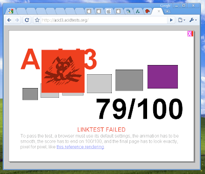
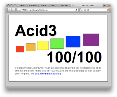
Chrome versus Browsers
Testing some software on MS Windows that is installed on my VirtualBox (of course), I've remembered about Google Chrome existence. I had no much chance to take a look at it earlier, but now I just wanted to see how this, supposed to be GUI-breathtaking innovative browser ever, fits in a real life. Obviously, Firefox is not any GUI-fanciness opponent as it's user interface always wants to be much better and, recently, rendering engine needs to be much better as well. Therefore I tried to see what I would love more: Chrome for my Mac (does not exists yet, but lots of dust and rumors around) or stick to Safari 4?

Global Menu
Apple has menu all the time at top of the screen, so you just "forgetting" about it and never pay attention much, thus can focus on your application. Now both, MS and Google, recognized that embedding menu bar into an application is ugly and annoying, after all. MS removed menu in IE8, making users puzzled finding all the settings. By the way, after long bloody battle with Gnome guys that mostly does not realizes it, finally happy Ubuntu users may try unstable alpha version in Gnome Tweaks but it does not works yet right for everything. KDE guys, however, successfully copied this feature from Apple long time ago.

So, no menus in Chrome too. At all. If you had installed Chrome: forget about menus. Wait, they are, but hidden...

Categories. No, sections. Well, never mind...
Google made it simpler (they think so): in a Chrome they put all the menu under one button, with an "Document" icon. Wait... under two buttons — other for settings and preferences.

So to open new tab, you click "Documents" and... and find there is no such item to create new tab! Ah, it is under icon with a monkey wrench, that represents "Settings". Oops, these actually are not really just a settings, but a pile of "everything else" that does not fits elsewhere.

I guess, third button is probably still coming in a next version, once Chrome will get some more features? Which icon it will be?.. A hammer?..

Where are my windows?
You have tabs for your websites. However, you have also a separate windows. You make a window and fill it in with a similar content. For example, I have 10 tabs in my window that are related to C++ documentation. Another window is for my pr0n social networking. Yet another is to something else, etc. Now, how I can easily switch between them by one click, selecting exactly what I need, without looking at WinXP's dock?

Maybe useful preferences
Let's see the preferences. It is common that in MS Windows you should mostly use mouse to find them, no short-cut available. But it is fair enough: click wrench and here they are. So what we see there? One picture is worth 128K words (I have Firefox, Opera and MSIE installed already):

WTF? Who the hell asked you to make a Chrome as a default browser?!! This is quite opposite to Safari (Google, do you see the combo box?):
I am in Japan, so when I search, Google is trying to show its smartness and forwards me to google.co.jp, searching over Japanese content. OK, I go to Google, set "Google in English" with a hope Chrome will remember cookie or so. No, it won't: search still searches over Japanese Google. OK, I click on a wrench, open Options, on "Default Search" I click "Manage", change Keyword "google.co.jp" to "google.com". Save. Now it should search in English, right? NO! It still searches over Japanese content! Well, I am OK to go to just google.com and just search it there as it is in a traditional way — that works fine...

And by the way, how to turn off Java applets in a Chrome that makes me full-screen-always-on-top-and-undecorated canvas that is impossible to close, then shows me an advertisement?..

Tabs
When you have them like a five or two, you can say they are just awesome. But let's look what happens in a real life:
Can you spot where is an Apple Store and do not mix it with Apple Developers community right away, just without using a magic crystal ball?.. Maybe Sergey Brinn and a Sauron from The Lord Of The Rings story can. But I can not. Hey, but how about Apple's way instead?

JavaScript and all the Ajax hype
I am definitely not a fan of Ajax. However, Google folks are. That's OK, God bless them. Wait, but what's this?
How this released thing suppose to bring "best Ajax experience" to user's desktop? Wait, how about this Beta instead?

Conclusion
Think different?! I'd be happy if most people would just think. What I really respect Apple for: they release only what they really had thinking through. I wish we have much more companies around like them.

So... My request to dear Google is to do not bring your shoddy work to Mac unless it is really worth to look at and unless it is at least equal to previous Safari 3 by usability.

*Please*

Java Swing: Rounded Corner Rectangle

I've decided to make labels small and standard, as in OS X. Well, hands down: drawing things right on 2D canvas still bad, e.g. rounded corners rectangle looks like an array of random pixels around. Here is how it looks like:


Too bad. I dislike it... Therefore I used raster instead and I've got very clean visuality. Here you go:

P.S. Oops, alpha is wrong, label is too dark as should be. :-)

Thursday, March 12, 2009

Carousel for UI: Pros and Cons

I've played around with Swing 2D a little bit. Then I thought: OK, if images can be viewed in carousel, maybe it is good idea to show running applications? Like a shrink to thumbnails and show as minimized windows, sort of a'la OS X exposé? Here is how this thing looks like:

Yup, it works: you click on any other window that is not in a center or use arrow keys "←" or "→" and you move to another one.

Used as a dashboard. Completely bad idea, probably. It looks like "Wow!!" to user, however after 3 minutes user realizes it is a pain to use, because what he is suppose to see right away in front of his eyes is actually covered. Dashboard supposed to show you information right in a moment you spot it.

Used as a menu. Only for stuff, like Apple TV. I've built one for myself, using Freevo at my home, getting a cheap-small-macmini-like PC and putting it behind my TV. For such sort of software, where user wants to relax and see fancy transitions on a very big screen with five menu items — this is a good choice to use carousel view.

Used for multimedia. Well, Apple did that in iTunes and iPods. Me — shrugs. I don't use it and none of my friends I know. Somebody might like to grep over a pile of album cover pages and visually trying to catch one like "Yeah! That's it!". But I prefer have a convenient powerful search instead, typing: "Met<ENTER>" and get for me "Metallica" playing right now.

For something else? Maybe could be done as miniature composition for a minimized windows, like OS X stacks or something. But still it looks ugly, frankly. Because these windows will never be fixed WxH pixels, and thus will never look slick in this way...

Where to put this to make it really useful for people? I have to think more, seems like... :-)

Tuesday, March 10, 2009

Bastardizing Java Swing on OSX

Everybody knows: Java Swing on Apple OS X is in a stone age times and looks still ugly enough even on co-called native look and feel (do not mention Metal, please, I am drinking coffee now). Not just that, but Apple also playing quite funky games, screwing LaF all around. So what is OK for Java 5, is not really OK for Java 6. I even frozen to think what is coming with Java 7...

Recent development version of NetBeans 6.7 has better look and feel on OSX. But if you take a look more closely, you will find it is still far away from what should be actually done.

I've tried myself to play with it. Again, Swing by architecture outperforms SWT, that is still (and probably forever) is using Carbon, instead Cocoa. But that's very bad news to those, who is using it: Carbon probably gone in Snow Leopard. Swing, on the other hand, has a destiny to be permanently fake maker, drawing everything by itself.

Well, anyway. Focused and passive window looks like this for me in Java 5 and Java 6 for Leopard — notice also a scrollbar... :-)

Cool? No! I am actually very disappointed by... Apple. They're completely screwed Java 6 made it even worse than Java 5 (maybe because Java 6 was entirely handled by Apple?). Apple should push Java in front as a flagship product, but they're stick to Objective C, unfortunately (who the hell needs it on OpenBSD, for example?).

On one hand, the future of Java on Apple (and not only), however, is not that much dark anymore: it is at least open source (kudos to Sun). On the other hand, knowing how open source bazaar applies to projects — that's why X11 still sucks on desktops big time, no matter what you use there: KDE or GNOME (GUI No One Might Enjoy)...

Will see and contribute, right? :-)

Monday, March 09, 2009

NetBeans as a platform for software

I've just bit played with a NetBeans as a platform for my own plugins, created some and see how it works. I'd say, quite nice stuff, technically way better than Eclipse and overall impression is pleasant. You could use it for various desktop stuff, especially if you need IDE-like software and it is now. For example, if you want some management or monitoring system for enterprises that looks for doing business (read: looks damn ugly). Mostly it is very cool if you want to extend your system with various plugins etc. E.g. have UML modeling, but also have your own workflow builder etc.

However, if you ask me about software art or something serious, I would tell you that I would not use it for my projects (although I seriously considered NetBeans once).

Why?
  • It is too much "IDE-ish". Even an attempt to "make it right" as Blue Marine project [1] still contains too vivid smell of plugin-based platform. To get rid of it smell you need to remove a lot of things. It will suck more blood from your body that you just do it all yourself from the scratch.
  • Too heavy for JNLP. Even with one single "Hello World" plugin — almost 20MB.
  • You need do unnecessary wrapper-works and other hacks-n-tricks in order to use Swing-X components. Why?..
  • I don't like its Plugin Manager from user point of view (nothing wrong with it itself — works perfectly).
  • Plugin mechanism is too heavy and can be simplified to much lighter incarnation. It gets better, but still there is way too much XML.
Personally, I vote for minimalism or, if possible, extreme minimalism. I love to remove everything, unless it is just impossible remove everything else. With NetBeans, still, you have some persistent bits that I would love get rid of it for ever.

One curious thing: an author of Blue Marine complained that first attempt was actually done on a solution from scratch and he was completely unhappy with it, therefore he revealed NetBeans for himself. In fact, I am opposite... — the World is that different! :-)

_______________
1. Frankly, I have just zero idea who needs this thing on Windows with Google Picasa, on Mac with iPhoto and on Linux with F-Spot... Well, but anyway somebody has a fun, right?

Sunday, March 08, 2009

Usability From Redmond

I've just installed Microsoft Vista (fouling my holy CV) to make sure Java Swing GUI looks nearly as close as possible to this taste-less Mac OS X cloning failure. OK, one thing makes me happy: it is a virtual machine (easier to delete it all).

One moment that gave me good laugh how these M$ folks are trying to think about usability. OK, I do not need those ritzy widgets, maybe I even do not need anymore that quite big ribbon at the right side that serves them. So what I did: tried to close by clicking either "->" button or just dragging it away. Right?..

Wrong! Vista "knows better". They probably spent one more million dollars on a research how to handle what user wants to do and then suggest "right way". In my case, Vista asked: "Do you want to close side-bar?" — and offered me a "right way" how to do that. Of course, it is Microsoft way: you need to right-click on it, select an item from menu "Close side-bar" that is messed up with other items barely readable small font and then get a confirmation bubble that side-bar is closed.

Brain dead. Just brain dead. You've got it, Redmond, as you deserve the most: brain dead.

Friday, March 06, 2009

OpenSolaris 2008.11 on Virtual Box

I've just installed OpenSolaris (AKA "Slowlaris") on my new MacBook, using VirtualBox (screw you, VmWare!).

Overall, everything fubar, exactly as expected: now it finally boots from GRUB and does not hangs as before, trying to use AMD on Core Duo; network is OK and won't suck anymore, as it did in "Nevada" build; video barely works in a simple mode and VBox Additions won't help you out of the box.

To fix video working full-screen and seamless mode, it is needed to be manually fixed, by simply removing away all of those display resolution modes from /etc/X11/xorg.conf file and also setting up virtual machine with 64Mb of video memory.

Second step is audio that won't work anyway anywhere, unless you manually debug it again (as described above). First, throw away slim_install package, a waste of space dependency that keeps root of all evil: SUNWaudiohd package. After those two gone, get OSS driver for Slowlaris and install it (pkgadd -d package-file.pkg):
Open Sound System installation complete
You can use osstest command to test audio playback in your system.
It may be necessary to reboot the system before all devices get properly detected by the system.
Installation of OSS was successful.
Damn great! Unix follows now the most popular trends, exactly like in good-old WinNT times: install a driver, reboot the system...

P.S. Sound still sucks on Solaris big time and also randomly crashes (/usr/sbin/soundoff and /usr/sbin/soundon cures current random crash). Well, never mind, I don't need sound during packaging software and, besides, I use iTunes on my Mac anyway... :-)

Tuesday, March 03, 2009

Swing and Hibernate (feedback)

I've found an example how to use Hibernate in Swing.

Not to mention weird existence of HQL entity in general, you have to use it for the very trivial SQL request. Why?.. Oh, that's a "short-cut" to automatically generate very inefficient and wrong SQL query, I see.

You also need a pile of XML to configure your ORM. Then you need another pile of XML to map your database stuff to the objects through these entities. Ah, right, you also need those excellent entities themselves just to hard-design your application, thus making it rock-stubborn against any minimum changes, removing any possible flexibility without whole recoding and recompilation. After all at the end, you also need to hard-code your QUERIES_BASED_ON_VARIOUS_CRITERIA (look at the code in the example to understand what I am talking about).

*Sigh*... It is just all pathetic... Disappoints even more, than that anyone could expect. Hey, folks, wake up! ORM supposed to make life easier, not harder!.. Therefore, if ORM concept does not makes your life any easier but generates a mess of general hodgepodge, maybe quite correct logical conclusion would be to do not use it at all?

Legacy databases solves legacy problems. We need new databases and new approach to the data management. Thus having it simple and understandable: keep sets away from objects.

Moral: Keep it simple, stupid.