Chrome versus Browsers
Testing some software on MS Windows that is installed on my VirtualBox (of course), I've remembered about Google Chrome existence. I had no much chance to take a look at it earlier, but now I just wanted to see how this, supposed to be GUI-breathtaking innovative browser ever, fits in a real life. Obviously, Firefox is not any GUI-fanciness opponent as it's user interface always wants to be much better and, recently, rendering engine needs to be much better as well. Therefore I tried to see what I would love more: Chrome for my Mac (does not exists yet, but lots of dust and rumors around) or stick to Safari 4?Global Menu
Apple has menu all the time at top of the screen, so you just "forgetting" about it and never pay attention much, thus can focus on your application. Now both, MS and Google, recognized that embedding menu bar into an application is ugly and annoying, after all. MS removed menu in IE8, making users puzzled finding all the settings. By the way, after long bloody battle with Gnome guys that mostly does not realizes it, finally happy Ubuntu users may try unstable alpha version in Gnome Tweaks but it does not works yet right for everything. KDE guys, however, successfully copied this feature from Apple long time ago.
So, no menus in Chrome too. At all. If you had installed Chrome: forget about menus. Wait, they are, but hidden...
Categories. No, sections. Well, never mind...
Google made it simpler (they think so): in a Chrome they put all the menu under one button, with an "Document" icon. Wait... under two buttons — other for settings and preferences.
So to open new tab, you click "Documents" and... and find there is no such item to create new tab! Ah, it is under icon with a monkey wrench, that represents "Settings". Oops, these actually are not really just a settings, but a pile of "everything else" that does not fits elsewhere.
I guess, third button is probably still coming in a next version, once Chrome will get some more features? Which icon it will be?.. A hammer?..
Where are my windows?
You have tabs for your websites. However, you have also a separate windows. You make a window and fill it in with a similar content. For example, I have 10 tabs in my window that are related to C++ documentation. Another window is for my pr0n social networking. Yet another is to something else, etc. Now, how I can easily switch between them by one click, selecting exactly what I need, without looking at WinXP's dock?
Maybe useful preferences
Let's see the preferences. It is common that in MS Windows you should mostly use mouse to find them, no short-cut available. But it is fair enough: click wrench and here they are. So what we see there? One picture is worth 128K words (I have Firefox, Opera and MSIE installed already):
 WTF? Who the hell asked you to make a Chrome as a default browser?!! This is quite opposite to Safari (Google, do you see the combo box?):
I am in Japan, so when I search, Google is trying to show its smartness and forwards me to google.co.jp, searching over Japanese content. OK, I go to Google, set "Google in English" with a hope Chrome will remember cookie or so. No, it won't: search still searches over Japanese Google. OK, I click on a wrench, open Options, on "Default Search" I click "Manage", change Keyword "google.co.jp" to "google.com". Save. Now it should search in English, right? NO! It still searches over Japanese content! Well, I am OK to go to just google.com and just search it there as it is in a traditional way — that works fine...
And by the way, how to turn off Java applets in a Chrome that makes me full-screen-always-on-top-and-undecorated canvas that is impossible to close, then shows me an advertisement?..
Tabs
When you have them like a five or two, you can say they are just awesome. But let's look what happens in a real life:

Can you spot where is an Apple Store and do not mix it with Apple Developers community right away, just without using a magic crystal ball?.. Maybe Sergey Brinn and a Sauron from The Lord Of The Rings story can. But I can not. Hey, but how about Apple's way instead?
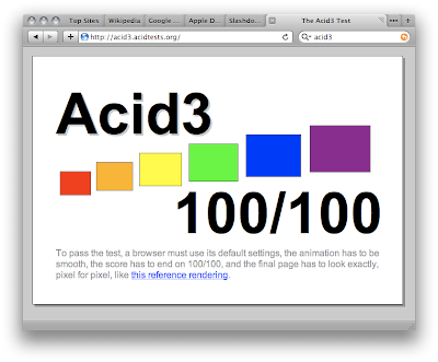
JavaScript and all the Ajax hype
I am definitely not a fan of Ajax. However, Google folks are. That's OK, God bless them. Wait, but what's this?

How this released thing suppose to bring "best Ajax experience" to user's desktop? Wait, how about this Beta instead?

Conclusion
Think different?! I'd be happy if most people would just think. What I really respect Apple for: they release only what they really had thinking through. I wish we have much more companies around like them.
So... My request to dear Google is to do not bring your shoddy work to Mac unless it is really worth to look at and unless it is at least equal to previous Safari 3 by usability.
*Please*


No comments:
Post a Comment